When Numbers Speak Louder Than Words
Rea,
Sometimes the hardest part of solving a problem isn’t knowing what’s wrong - it’s getting other people to listen and help fix it. Back in 1855, a nurse named Florence Nightingale faced exactly this challenge in a military hospital during the Crimean War.
Every day, Florence watched soldiers die in her hospital. Not from battle wounds, but from diseases that spread because the hospital wasn’t clean enough. She tried telling the officials in charge that they needed better cleaning procedures and fresh air in the wards. But nobody would listen to her concerns.
Florence realized that just describing the problems wasn’t working. She needed a way to make people understand how serious things were. That’s when she had an idea: what if she could show them with numbers and pictures instead of just words?
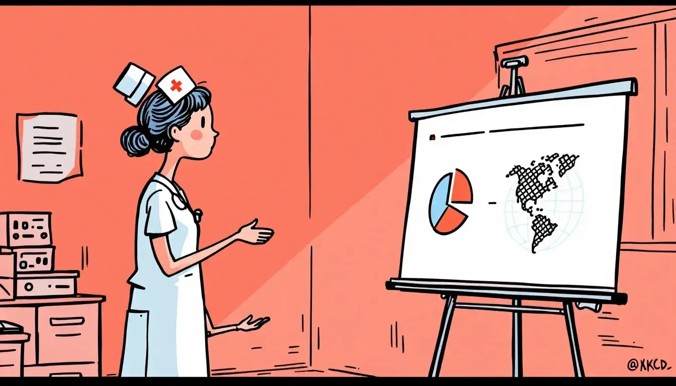
She started keeping careful track of every patient. For each soldier who died, she wrote down exactly what caused it. Then she turned these numbers into special circular charts, like pie charts but with sections that grew longer or shorter to show changes over time. Each cause of death had its own color, making it easy to spot patterns.
Her charts showed something shocking: for every 1 soldier who died in battle, 7 more were dying in hospitals from diseases that could have been prevented. In some months, 42% of soldiers in the hospital died (that’s 42 out of every 100!) - not from war wounds, but from problems that could be fixed with better cleaning and care.
When Florence showed these charts to the officials, everything changed. They couldn’t ignore the numbers right in front of them. The charts told a clear story: too many soldiers were dying needlessly. The officials finally agreed to clean up the hospitals, bring in fresh air, and improve conditions.
The results were dramatic. After the changes, the death rate dropped from 42% to just 2%. Florence’s charts had helped save thousands of lives. Her way of using percentages to tell important stories changed how people solve problems forever. Even today, doctors and scientists use similar charts to understand and explain complex information.
Florence showed that sometimes the best way to change things is to help people see the truth through numbers. The percentages you’re learning now are a powerful way to understand and explain important things.
Love, Abba

